
Old Eyes
A vision age gap rant

Old eyes vs. young packaging designers. I’m talking about the lack of awareness among young designers of the changes in vision that occur as we age.
My first encounter with the vision age gap occurred when I received an Anthropologie catalog several years ago. I knew then that I wasn’t their target market, but I often bought tops and shirts from them and enjoyed looking through the catalog.
I was reading it by my bedside lamp. I couldn’t make out the info because of the lack of contrast. I may have made the grey in the above image darker than the page actually was, now that I am looking at it on a well-lit screen.
Recently, I have become complacent with the tiny B&W printing on packaging. That’s what readers/cheaters/glasses are for, right? And I can always go grab my husband’s magnifying glass if necessary. Even in tiny print, I can usually infer the text from context.
It was the packaging of a well-known organic oatmeal brand that prompted this rant. Tiny print, no contrast. I had to gather my “reading aids for the elderly,” as Amazon calls them, and find a well-lit spot at 7 am on an overcast winter morning to read the directions.
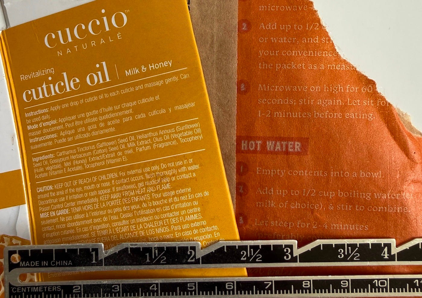
And then came the bottle of cuticle oil I desperately needed for the torn cuticles I got this winter from months of packaging and shipping the items in my nowclosed Stash Shop. It had rave reviews and lovely packaging, except for - you guessed it - the directions. I knew how to use it, but how often, and what did the Caution statement say? Time for the magnifying glass, but a greater contrast may have saved the effort.
I understand the need to cram information on packaging, but the lack of contrast is ridiculous. Beauty and design over function?
What’s your take on this? Is it just an old lady rant? Am I shopping outside my age range, or are designers not fully aware of the needs of all their customers?
Quotes of the Week
We are always the same age inside.
Gertrude Stein
My loyalty is to the inner vision, whenever and howsoever it may arrive.
Mary Oliver
Eyes that see do not grow old.
Proverb
The whole secret of the study of nature lies in learning how to use one’s eyes.
George Sand
Vision is the art of seeing what is invisible to others.
Jonathan Swift
As a retired graphic designer, I have observed this trend for a long time. But I think it's more than poor design for "old" eyes. It's poor design period. I'm not convinced that "younger" eyes enjoy reading small type and low contrast. I stopped reading Wired magazine a long time ago because the type was so small and annoying even though I was interested in many articles. I think we should all complain to the companies guilty of this!
I daresay you are hitting a very sore button with many here who read your essays. This is why I have my Cliq reading glasses on all the time when I am awake. (These hang around your neck and then there is a magnet between the lenses. And I always know where my glasses are! You can buy them online BTW))
I think there are a LOT of things that younger people never consider that has to do with the changes older people experience. These thing affect what they hear and see in every day life. It's sad really, but no one tells you how it is and so you continue as you always did. One thing that really drives me nuts is how FAST younger people (and I don't mean children) talk. I would say that on a daily basis I have to tell someone, please talk more slowly, I don't know what you just said. This is especially a major drag when you need to know what they just said for important information, or a date and time they are giving you.
When you do tell someone to please speak more slowly or whatever, they do it for about 2 seconds and then are back at it.
OK, I'll stop now, but yes, everything you wrote is sadly the case and I don't see it changing any time soon, if ever.